Nano Banana 2.1 Image Generator for Posters and Covers
Nano Banana 2.1 is Google’s image generator and photo editor. Use it on Freepik AI to draw lettering into a poster, carry the illustration over to a square cover, or revise a design from a reference image.
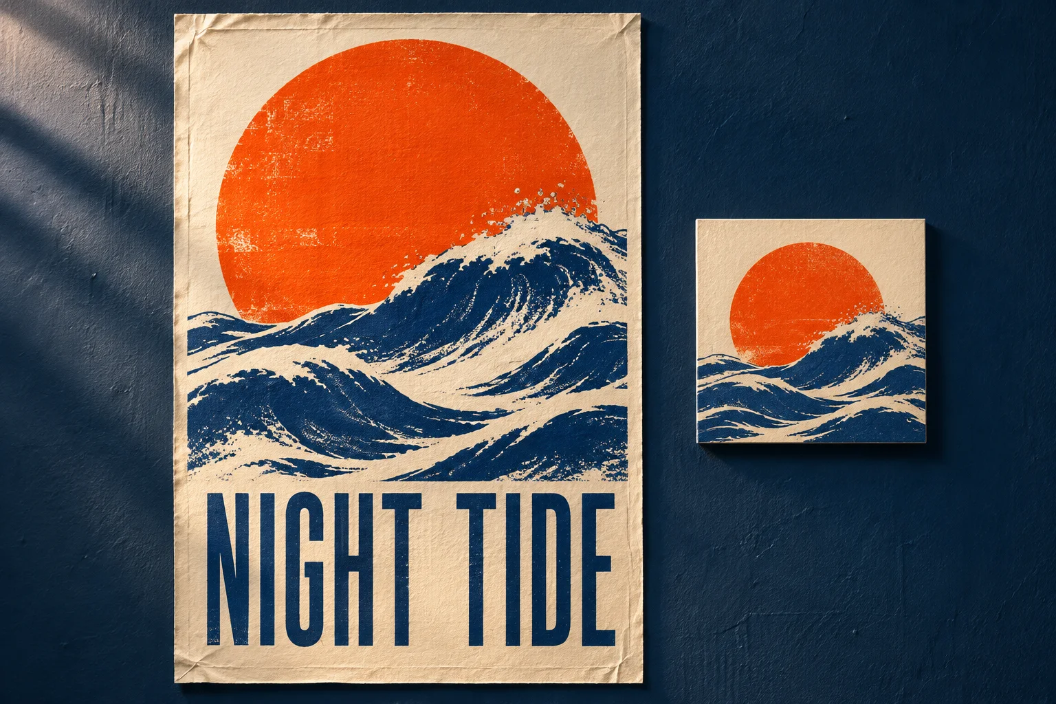
Design the poster once, then change the tour stop
For Night Tide, the brief calls for one music poster, two city announcements and a square release cover. The orange sun and indigo waves should be recognizable on all three. The tour title can share the rough ink of the illustration. Austin and San Francisco need different dates, and a listener browsing the release cover has little use for either one.
Open the image generator with Nano Banana 2.1 selected. Start with a portrait canvas such as 2:3 and give the title exactly as it should appear, including the space between the words. Describe the relationship between the illustration and the lettering. “Set ‘NIGHT TIDE’ in tall indigo capitals on an ivory band below the waves” gives the model a position, an ink color and the two words to draw.
At 1K, check the first proof at two sizes. In a thumbnail, the wave and the title should still read as separate shapes. At full size, check the letters individually, especially the slim gap between the T and the I in TIDE. When the spelling is right but the last letter runs into the edge, ask for a wider right margin while keeping the same title and illustration. Save the approved artwork before adding any tour information.
Two city posters from the same artwork
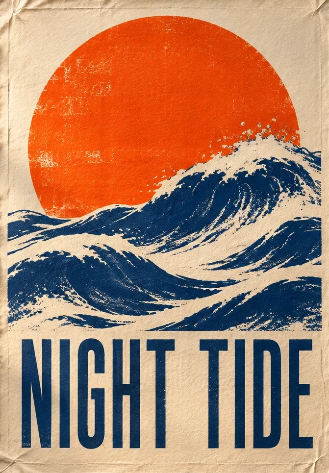
Look at the bottom of the original print in the image at the top of the page. The title almost fills the width, with only a narrow margin below the letters. Trying to fit the city and date into that margin would force both into small type. In the two editions above, the cream strip extends the sheet. The tour stop has its own line, so the longer “SAN FRANCISCO” can use the full width. The date starts at the same left edge in both versions.
To make your editions, place the finished poster in a layout editor and lock the artwork layer. Add the city and date as separate text fields. Set the widest city first, then duplicate the layout for the shorter name. This lets you keep one type size across the run. If a venue moves the Austin show by a week, edit the date in that file and re-export it. The printed title keeps its original letter shapes, and the other venue can keep using its approved file.
Before sending both versions out, cover the illustration on screen and read just the information strip. It should be easy to pair each city with its date. Then uncover the illustration and view the poster at the size of a social preview. If the date disappears, give the strip more height or increase the date size in the layout editor. Making the entire image larger leaves the same small type when the poster is displayed at the original size.
Make a square cover that works without the tour date
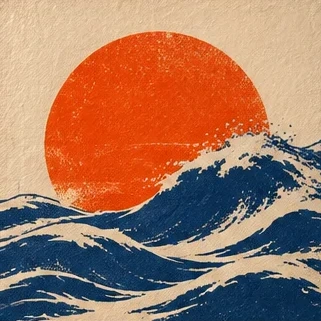
Start from the approved portrait artwork, before the city strip was added. Open image-to-image mode, upload the portrait, choose a 1:1 canvas, and tell Nano Banana 2.1 which shapes carry the design. For this cover, keep the orange disk, the crest crossing its lower edge and the grain of the ivory paper. Give the wave room to break toward the right edge. A square cut from the center of this portrait clips the top of the sun and leaves fragments of the tall letters along the bottom. Reframing the illustration gives both shapes a clean edge.
Use the intended placement to decide whether to bring the title back. A streaming listing that prints the release name beside the thumbnail can use the image-only sleeve shown here. For a physical sleeve that has to identify itself on a shelf, reserve a new space for the title. Put the square and the portrait side by side at thumbnail size. You should recognize the same release even when only one carries the words.
Choose the model and export for the next use
For poster lettering, Nano Banana 2.1 or Nano Banana 2? Google improved text rendering and layout in 2.1. If version 2 keeps losing a letter in a short title, compare a 2.1 version using the same wording, portrait ratio and title position. If the existing title is already approved and only the city changes, the layout file already gives you the quickest edit.
For a static sleeve or an animated teaser? Nano Banana 2.1 suits a square still based on the approved poster. If the release also needs a loop, GPT Image 2.6 offers GIF output in Freepik AI’s text-to-image mode. A single movement, such as the wave rising across the sun, gives the teaser a clear connection to the sleeve. Deliver the static cover separately for placements that call for still artwork.
Keep the editable tour layout alongside the exported city posters. Use PNG for crisp lettering and a JPG copy when the venue needs a lighter web preview. For print, divide the exported pixel width by the intended width in inches and compare that figure with the printer’s requested pixels per inch. For example, a file 2,400 pixels wide delivers 300 pixels per inch at eight inches wide and 150 at sixteen. Measure the file you are sending, including the extra city strip if it is part of the deliverable.
For a venue that trims posters after printing, ask for its trim size and bleed allowance before placing the date. Extend the background into the bleed and keep the date inside the trim line. A quick proof is to print just the bottom corner at the intended scale. You can check the date size and the edge margin on one sheet of paper.
Use 2K or 4K for a final render, or take an approved composition to the image upscaler if it needs more pixels. Check the smallest date on the exported file at its final size.
Frequently Asked Questions
Make the first version of your poster
Bring a short headline and a visual motif. Try the portrait layout before adapting it for a cover.
Design with Nano Banana 2.1